1
2
3
4
5
6
7
8
9
10
11
12
13
14
15
16
17
18
19
20
21
22
23
24
25
26
27
28
29
30
31
32
33
34
35
36
37
38
39
40
41
42
43
44
45
46
47
48
49
50
51
52
53
54
55
56
57
58
59
60
61
62
63
64
65
66
67
68
69
70
71
72
73
74
75
76
77
78
79
80
81
82
83
84
85
86
87
88
89
90
91
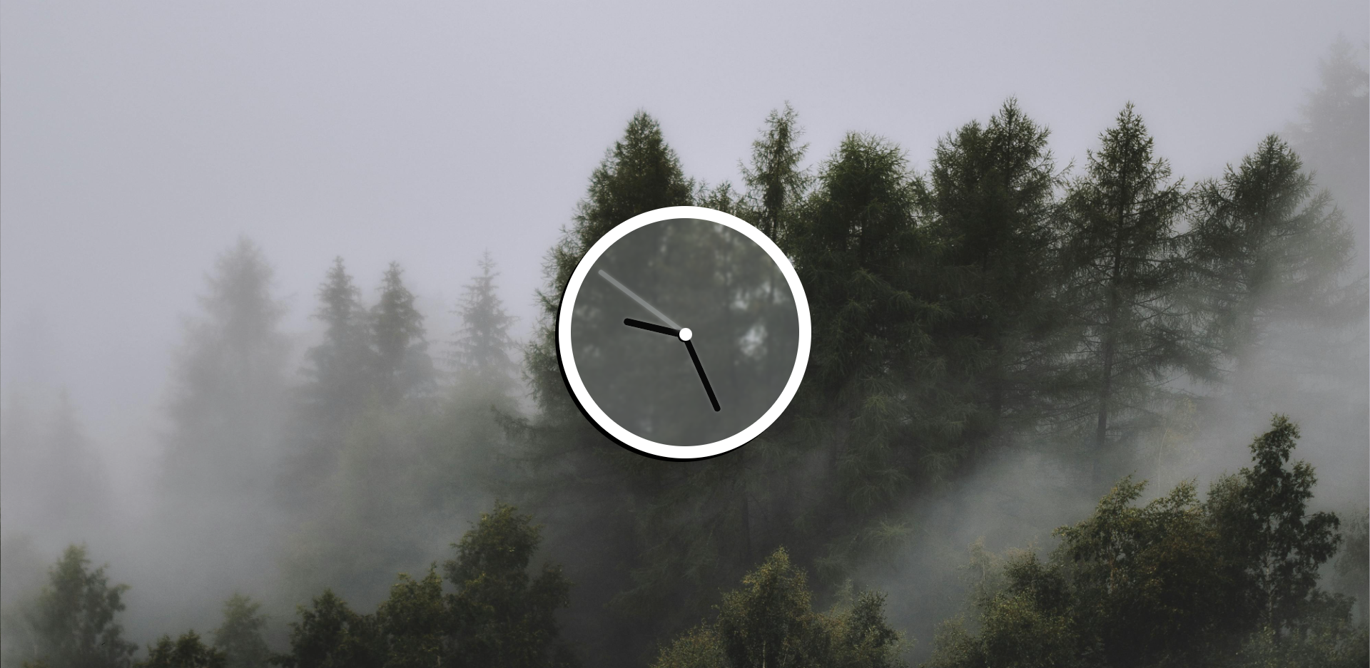
| * {
border: 1px rgba(128, 255, 0, 0) solid;
}
body {
background-image: url('bg.jpg');
background-size: cover;
display: flex;
flex: 1;
align-items: center;
min-height: 97vh;
}
.clock {
margin: auto;
height: 300px;
width: 300px;
border: rgb(255, 255, 255) solid 17px;
box-shadow: -5px 5px 0px black;
border-radius: 50%;
padding: 10px;
backdrop-filter: blur(2px);
background-color: rgba(240, 248, 255, 0.211);
}
.clock-face {
position: relative;
width: 100%;
height: 100%;
transform: translateY(-3px);
}
.hand {
height: 10px;
position: absolute;
top: 50%;
transform-origin: 98%;
transition: all 0.05s;
transition-timing-function: cubic-bezier(0.2, 1.5, 0.5, 2);
}
.hour-hand {
width: 50%;
display: flex;
}
.hour-hand .trans {
flex: 4;
}
.hour-hand .black {
height: 8px;
width: 100%;
background: rgba(0, 0, 0, 0.9);
box-shadow: 0 0 5px rgba(255, 255, 255, 0.241);
border-radius: 6px;
flex: 6;
}
.min-hand {
width: 50%;
display: flex;
}
.min-hand .trans {
flex: 2;
}
.min-hand .black {
height: 7px;
background: rgba(0, 0, 0, 0.9);
box-shadow: 0 0 5px rgba(255, 255, 255, 0.241);
border-radius: 6px;
flex: 8;
}
.sec-hand {
height: 5px;
width: 50%;
background: rgba(255, 255, 255, 0.09);
backdrop-filter: blur(2px);
box-shadow: 0 0 5px rgba(255, 255, 255, 0.241);
border-radius: 6px;
display: flex;
}
.centerDot {
position: fixed;
width: 5%;
height: 5%;
background: rgb(255, 255, 255);
box-shadow: -2px 2px 0px black;
border-radius: 50%;
left: 47.5%;
top: 48%;
}
|